
Short answer: The NIST Phish Scale is a method from NIST researchers for rating how hard a phishing email is for people to detect. It combines the number of observable cues with how well the premise fits the recipient's work. Rating every simulation lets you read click rates in context and show auditors a security awareness program that measures real progress.
Related guides:
- Cybersecurity awareness training
- 14 pro tips to help you create a security awareness and training policy
- Build a strong security culture
Key takeaways
- A phishing click rate means little on its own, because it depends on how hard the email was.
- The NIST Phish Scale rates each simulation as least, moderately or very difficult to detect, based on observable cues and premise alignment.
- Rate every simulation before you send it, then report click and report rates by difficulty level, not as one blended number.
- Plan a quarterly calendar that mixes difficulty levels on purpose, so trends reflect behavior instead of template choice.
- For SOC 2, ISO 27001 and HIPAA audits, keep training records, rated results and follow-up evidence together.
What is the NIST Phish Scale?
The NIST Phish Scale is a structured way to rate the human detection difficulty of a phishing email, so you can interpret simulation results fairly. It was developed by researchers at the National Institute of Standards and Technology, and NIST published a user guide for it as NIST Technical Note 2276 in 2023. It does not tell you which emails to send. It gives you a repeatable way to describe how hard each email was.
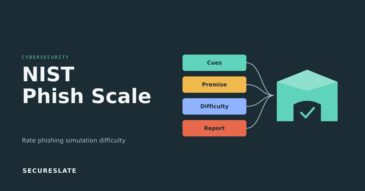
The scale looks at two things:
- Observable cues. The visible signs in the email that something is wrong.
- Premise alignment. How well the story the email tells fits the recipient's job, context and expectations.
Why do raw phishing click rates mislead?
Raw click rates mislead because they change with the email you choose as much as with how well your people spot phishing. An obvious prize scam one quarter and a convincing internal system notice the next will move the click rate even if nobody's skills changed. That causes three problems:
- False progress. Teams can drift toward easier templates. The chart improves, the workforce does not.
- False alarms. A spike after a hard, well-targeted simulation can trigger needless escalation.
- No comparison across teams. If groups get different templates, you cannot tell a weaker team from a harder email.
The fix is to attach a difficulty rating to every result. That turns the click rate into one of your more useful security awareness metrics instead of a number that invites debate.
How does the NIST Phish Scale rate difficulty?
The NIST Phish Scale rates difficulty by counting observable cues and judging premise alignment, then reading the two together. The summary below is conceptual, so use the guide's own worksheets when you rate real campaigns.
Step 1: Count observable cues
Count the cues a careful reader could use to spot the email as phishing. The guide groups cues into five categories:
| Cue category | What it covers | Examples |
|---|---|---|
| Errors | Mistakes a legitimate sender would rarely make | Spelling and grammar errors, inconsistent formatting |
| Technical indicators | Signals in addresses, links and attachments | Mismatched sender domain, link text that does not match the URL, unexpected attachment type |
| Visual presentation indicators | How the email looks | Missing or distorted logo, unusual layout, missing signature details |
| Language and content | What the message says and how | Generic greeting, requests for credentials, out-of-character tone |
| Common tactics | Persuasion techniques attackers rely on | Urgency, threats of account loss, too-good-to-be-true offers |
The total places the email at few, some or many cues. More cues make an email easier to detect.
Step 2: Rate premise alignment
Premise alignment asks how well the email's scenario fits the people receiving it. Does it relate to their actual work, imitate a real process or system, or arrive when they would expect such a message? Alignment is rated low, medium or high, and higher alignment makes an email harder to detect. It depends on the audience: the same email can be high alignment for billing and low for engineering.
Step 3: Combine the two
The guide combines the cue rating and the premise alignment rating in a lookup table that assigns each combination one of three difficulty levels: least difficult, moderately difficult or very difficult. The general logic is intuitive. An email with many cues and a premise that does not fit the audience sits at the easy end, and an email with few cues and a premise that fits the audience's daily work sits at the hard end. Take the exact rating for each combination from the official table in NIST Technical Note 2276 rather than estimating it, and record which version of the guide you used.
Worked example: rating two simulation emails
Both emails below are invented for illustration and sit at the two extremes of the scale, where the rating is least ambiguous. Confirm any rating you publish against the official table in TN 2276. Both target the customer support team at a hypothetical HealthTech company.
Email A: "You have won a gift card"
- Content: a free webmail sender offers a gift card "if you click within 24 hours," with a generic greeting, spelling errors, a blurry logo and a shortened link.
- Cues: cues in all five categories, including several spelling errors, a free webmail sender, a shortened link, a blurry logo, a generic greeting and prize and urgency tactics. Count each one individually on the worksheet.
- Premise alignment: support agents do not expect gift cards from strangers at work, so alignment is weak.
- Where it lands: with many cues and weak alignment, expect the easy end of the scale. Apply the guide's cue-count bands and lookup table for the exact rating.
Email B: "Ticket escalation: patient portal access issue"
- Content: a clean, branded notification from the company's real ticketing tool name, sent from a lookalike domain, with a plausible ticket number and a "View ticket" button.
- Cues: only a lookalike sender domain and mild urgency.
- Premise alignment: agents handle escalations daily in that tool, so alignment is strong.
- Where it lands: with very few cues and strong alignment, expect the hard end of the scale. Again, take the exact rating from the guide.
If Email B drew more clicks, an unrated dashboard says the team got worse. The rated view shows a realistic lure still works, which points to training on verifying sender domains.
Which premises fit HealthTech teams?
HealthTech teams face premises tied to clinical systems, referrals and payers, so simulations should reflect those workflows. Generic prize lures mostly rate as low alignment and tell you little about real risk.
| Hypothetical premise | Most relevant audience | Likely alignment |
|---|---|---|
| EHR password reset or "your EHR session will expire" notice | Clinical staff, implementation and support teams who access customer EHR integrations | High |
| Fax or referral notice: "New referral received, open secure document" | Care coordination, intake and operations teams | High |
| Payer portal message: "Claim status update requires your review" | Billing, revenue cycle and customer success teams | High for billing, low for engineering |
| Cloud console billing alert | Engineering and DevOps | High for engineering, low for clinical teams |
Rate alignment per audience and record which group received which version. Avoid premises that mimic urgent patient-care situations: simulations that could delay real clinical work cause more harm than learning.
How do you build a quarterly simulation calendar?
Build a calendar that mixes difficulty levels on purpose and repeats comparable difficulty over time, so trends are meaningful:
- Define audiences by role and systems used, such as clinical operations, billing and engineering.
- Rate every template for each audience before it enters your library.
- Schedule one simulation per difficulty level per audience each quarter, staggered so people do not compare notes.
- Repeat difficulty bands, not templates. Compare moderately difficult results quarter over quarter using different emails.
- Tie each simulation to a lesson on the cues and premise it used.
An illustrative quarter for one audience:
| Month | Simulation | Target difficulty (confirm against TN 2276) | Follow-up |
|---|---|---|---|
| Month 1 | Generic shipping notice with several obvious cues | Easy end | Short refresher on common cues |
| Month 2 | Shared document invitation from a lookalike customer domain | Middle | Module on checking sender domains and links |
| Month 3 | Payer portal message matching the team's real workflow | Hard end | Targeted session on verifying requests through known channels |
Track the report rate (people who reported the email through your official channel) alongside clicks. A rising report rate on very difficult simulations is one useful signal that training is changing behavior. It also fits role-based SOC 2 training.
What should you report to leadership and auditors?
Report results by difficulty level with trends and follow-up actions, and keep the evidence organized for audits.
For leadership, each quarter: click and report rates per difficulty level versus last quarter, the audiences with the weakest results at harder levels, and actions taken such as targeted training or improved email filtering.
For auditors, keep this evidence ready:
| Evidence | What it shows | Framework relevance |
|---|---|---|
| Security awareness policy and training plan | The program is defined and approved | SOC 2 security criteria, ISO 27001 Annex A 6.3, HIPAA security awareness and training standard |
| Training completion records with dates | People were trained on hire and periodically | All three |
| Simulation results with NIST Phish Scale ratings | Testing is performed and interpreted consistently | Supports effectiveness of awareness controls |
| Follow-up training assignments and completion | Weaknesses were acted on | Shows the control operates, not just exists |
None of these frameworks requires phishing simulations by name, but rated results can support your evidence that awareness training is running and being measured.
How SecureSlate helps
SecureSlate does not send phishing simulations itself. It gives SMB and HealthTech teams one place to run the compliance side of the program you run with your simulation tool. Approve your security awareness policy, map it to SOC 2, ISO 27001 and HIPAA controls, and upload training records, simulation reports with your difficulty ratings, and follow-up evidence against those controls. Log recurring weaknesses in your risk register so they get an owner and a follow-up.
FAQ
Is the NIST Phish Scale a compliance requirement?
No. It is a measurement method, not a requirement in SOC 2, ISO 27001 or HIPAA. Those frameworks expect security awareness training, and rated simulations show your training is measured consistently.
Can I use the NIST Phish Scale with any phishing simulation tool?
Yes. It is a manual rating applied to the email itself, so it works with any simulation platform. Record the rating alongside each campaign's results.
What is a good phishing click rate?
There is no single good number, because the answer depends on how difficult the simulation was. Look instead for falling click rates and rising report rates within the same difficulty level over several quarters.
How often should we run phishing simulations?
None of SOC 2, ISO 27001 or HIPAA sets a frequency. What matters most is a documented, consistent schedule that mixes difficulty levels and includes follow-up training.
Disclaimer (legal note)
This article is for general information only and is not legal, regulatory or professional advice. Requirements vary by framework, industry and jurisdiction. Consult qualified advisors for your specific obligations.
Need compliance without the complexity?
SecureSlate automates ISO 27001, SOC 2, GDPR, HIPAA, and more. Built for growing teams. See it in action.
Find compliance gaps in 30 seconds
